 Aminah Zaheer

Color accuracy is very important in packaging printing because it directly affects brand identity and product presentation. Choosing the right color system helps ensure packaging looks consistent across different materials, printing methods, and production batches.
Two of the most commonly used color systems in packaging printing are CMYK and Pantone. Understanding the difference between these systems helps brands choose the best option for their packaging needs.
What Is CMYK in Printing?
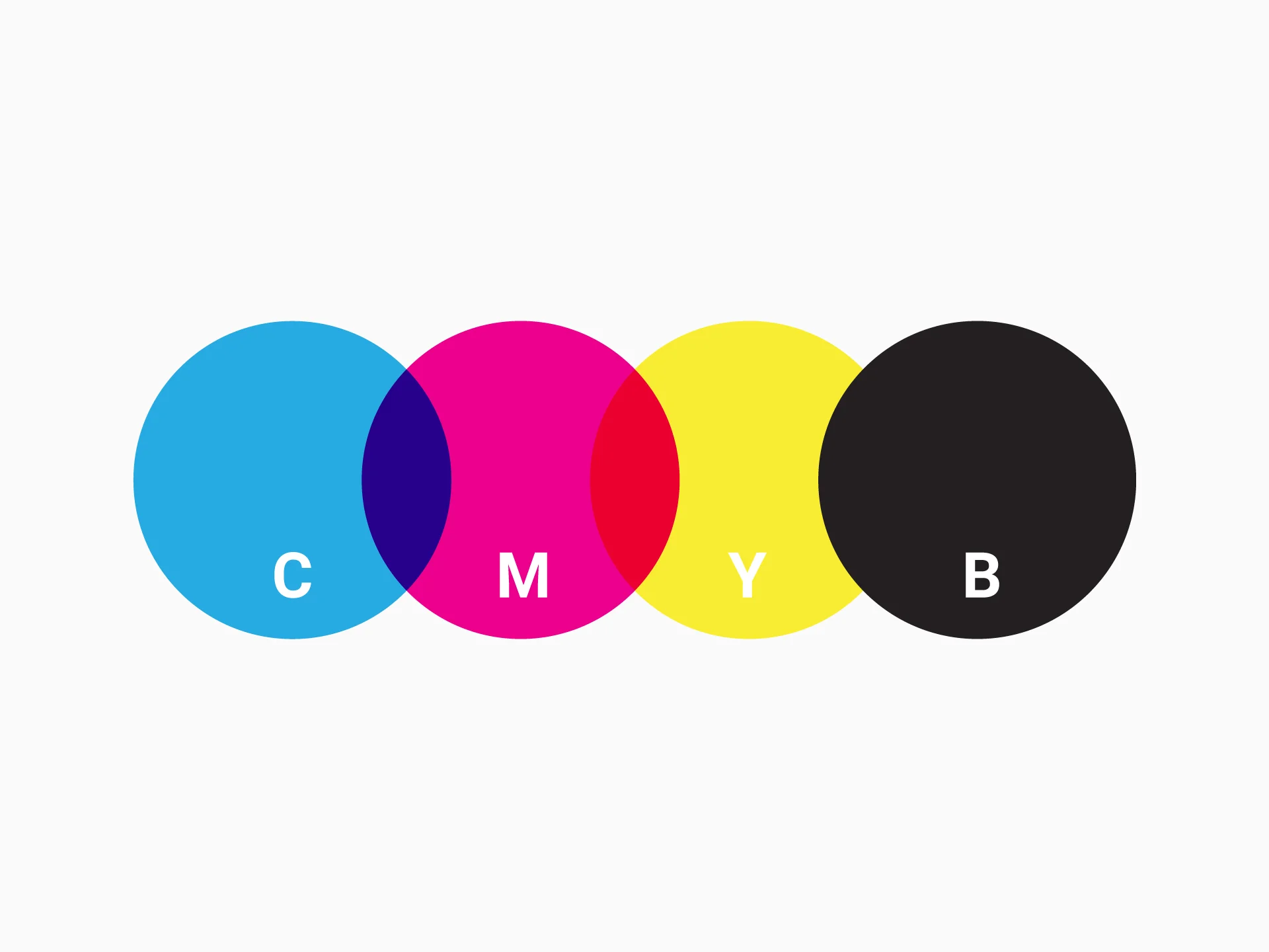
CMYK stands for Cyan, Magenta, Yellow, and Black, which are the four primary colors used in process printing. These colors are combined in different percentages to create a wide range of printed colors. CMYK is commonly used for printing images, gradients, and multi color packaging designs. It is widely used in digital printing and offset printing for packaging production.
CMYK works by layering tiny dots of each color to create the final printed color appearance. This method allows printers to produce complex designs with multiple color variations. CMYK is cost effective for high volume printing and full color packaging designs. However, some specific brand colors can be difficult to match exactly using CMYK printing.
What Is Pantone in Printing?
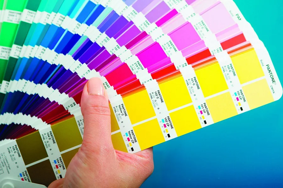
Pantone is a standardized color matching system that uses pre mixed inks to create specific colors. Each Pantone color has a unique code that ensures consistent color reproduction across different printers and materials. Pantone is commonly used for brand logos, brand colors, and packaging that requires exact color matching. It is widely used in luxury packaging, rigid boxes, and premium packaging products.
Pantone colors are printed using specific ink formulas instead of mixing colors during printing. This allows printers to achieve very accurate and consistent color results. Pantone printing is usually more expensive than CMYK because it requires custom ink preparation. However, it provides superior color accuracy for brand sensitive packaging.
CMYK vs Pantone Comparison in Packaging Printing
|
Feature |
CMYK |
Pantone |
|
Color System Type |
Process color system |
Spot color system |
|
Number of Colors |
Created by mixing four base colors |
Pre mixed individual colors |
|
Best For |
Images, gradients, multi color designs |
Brand colors, logos, solid colors |
|
Color Accuracy |
Good but not always exact |
Very high and precise |
|
Printing Cost |
Lower cost for multi color printing |
Higher cost due to custom inks |
|
Consistency Across Materials |
May vary slightly |
Very consistent |
|
Usage in Packaging |
General packaging printing |
Premium and brand focused packaging |
When to Use CMYK in Packaging Printing?
CMYK printing is a versatile and cost effective option for many packaging projects. It works best in situations where full color designs, images, or gradients are required.
1. For Detailed Images and Photographs
CMYK is ideal when your packaging design includes photographs, intricate illustrations, or complex graphics. The four color process allows for smooth gradients, detailed images, and realistic color reproduction. This makes CMYK perfect for product packaging that relies on visual appeal to attract customers.
2. For Large Volume Production
CMYK printing is cost effective for large production runs because it uses standard inks and process printing. It allows brands to produce hundreds or thousands of packages without incurring high costs for custom inks. This makes it a practical choice for mass produced retail packaging and promotional items.
3. For Retail and Marketing Focused Packaging
CMYK is commonly used in retail packaging, product labels, and marketing materials that require bright, colorful designs. It can handle multi color logos, images, and text in a single print run efficiently. Using CMYK helps businesses maintain attractive, eye catching packaging while keeping production affordable.
When to Use Pantone in Packaging Printing?
Pantone printing is the best choice when exact color matching and consistent brand representation are critical. It uses pre mixed spot colors to ensure every print matches the brand’s color standards perfectly.
1. For Exact Brand Color Matching
Pantone is ideal for packaging that requires precise brand color reproduction. Each Pantone color has a unique code, which helps maintain consistency across different packaging runs and materials. This is especially important for brands that rely on color to communicate identity and quality.
2. For Luxury and High End Packaging
Pantone is commonly used in luxury packaging, premium rigid boxes, and other high value packaging products. The system ensures sharp, vibrant, and consistent colors that reflect a high end brand image. Luxury packaging often demands flawless color accuracy, which Pantone provides more reliably than CMYK.
3. When Color Accuracy Matters More Than Cost
Pantone is preferred when brand color precision is more important than printing cost savings. Although Pantone printing can be more expensive due to custom inks, it guarantees consistent colors across all packaging. It is the go-to choice for logos, brand marks, and premium packaging where slight color variations cannot be tolerated.
Can CMYK and Pantone Be Used Together?
Yes, CMYK and Pantone can be used together in packaging printing. This approach combines the flexibility of CMYK for detailed images with the precision of Pantone for exact brand colors.
In this setup, CMYK is typically used for full color backgrounds, photographs, and gradients, while Pantone inks are reserved for logos, brand marks, or other critical design elements. This ensures that important brand colors remain consistent and accurate, while still allowing complex, multi color designs to be printed efficiently.
When to Use CMYK and Pantone Together
- Packaging that has detailed images or gradients plus brand logos
- Luxury and premium packaging requiring exact color matching for logos
- Retail packaging where color consistency and cost efficiency are both important
When Not to Use CMYK and Pantone Together
- Small production runs where the cost of custom Pantone inks is not justified
- Packaging designs that are entirely full color without any critical brand colors
- Projects where only one printing system (CMYK or Pantone) is sufficient for the design needs
Using both systems together provides a practical balance between cost, quality, and brand consistency, making it a preferred choice for many packaging projects.
Why Choose HT Custom Boxes for CMYK and Pantone Packaging Printing?
At HT Custom Boxes, we help brands choose the right color system based on their packaging design, budget, and quality requirements. Our team works closely with clients to understand brand color standards and printing goals before production begins. Whether you need full color CMYK printing for detailed designs or Pantone printing for exact brand color matching, we ensure your packaging colors are accurate and consistent.
We use advanced color management tools, high quality inks, and calibrated printing equipment to maintain strong color consistency across every order. Our experience in luxury packaging and rigid boxes allows us to deliver premium packaging with sharp images, vibrant colors, and precise brand shades. From design file checking to final production quality inspection, we carefully control every stage to make sure your packaging meets professional and high end standards.
Contact HT Custom Boxes today to get packaging printed with perfect color accuracy and premium quality results for your brand.


.webp)


